
Choosing the right color combination is one of the most important parts of interior design. Many people struggle with mixing colors, which can make a room feel either too busy or too plain. The 60-30-10 rule is a simple and widely used design principle that helps create a balanced and visually appealing space.
This rule divides colors into three proportions to maintain harmony in a room. By following this method, you can easily design interiors that feel cohesive, stylish, and professionally designed.
What Is 60-30-10 Rule in Interior Design?
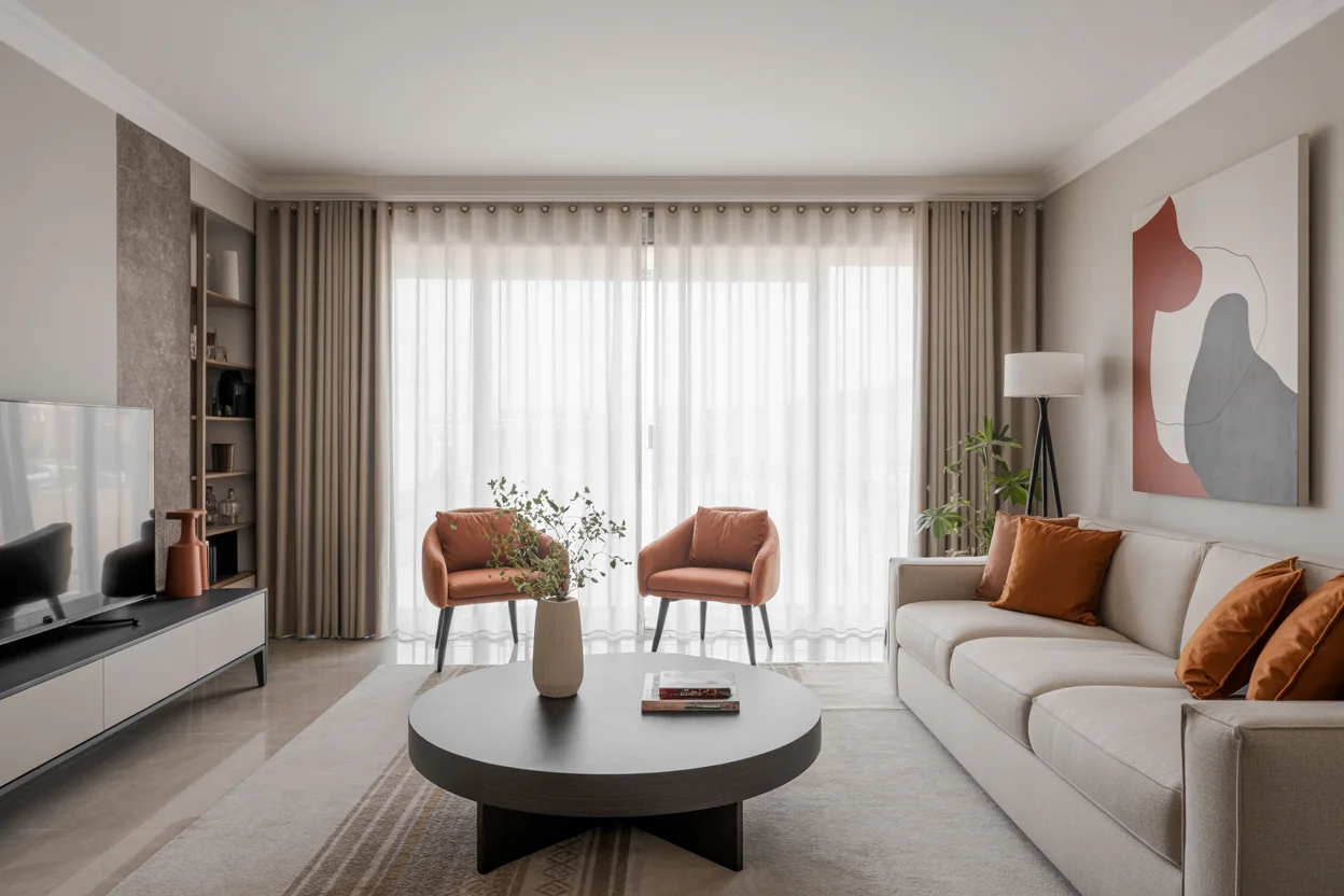
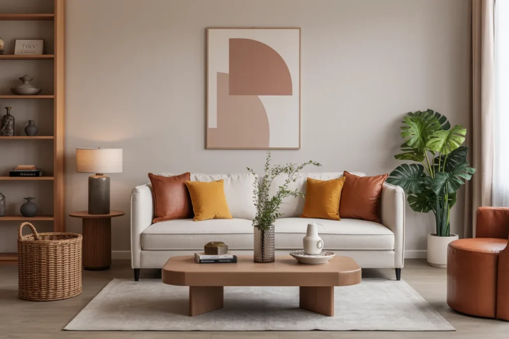
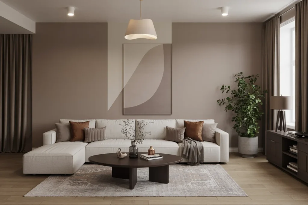
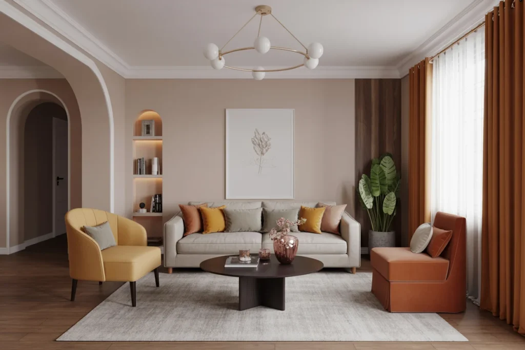
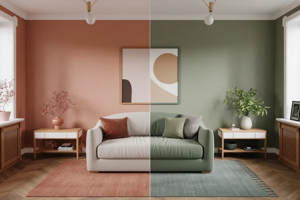
The 60-30-10 rule is a color distribution guideline used by interior designers to create balanced spaces. It divides a room’s color palette into three parts based on percentages.
- 60% – Dominant Color
- 30% – Secondary Color
- 10% – Accent Color
This structure ensures that one color leads the design while the other colors support and highlight the overall style. The result is a room that looks balanced rather than overwhelming.
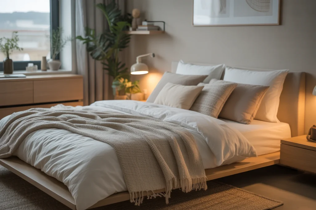
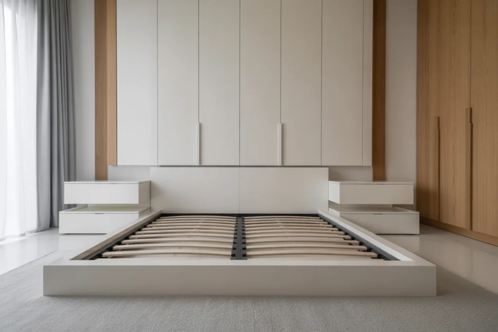
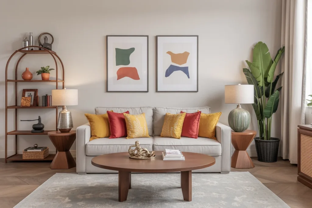
60% – The Dominant Color
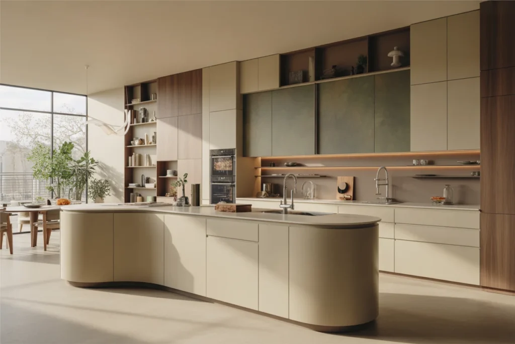
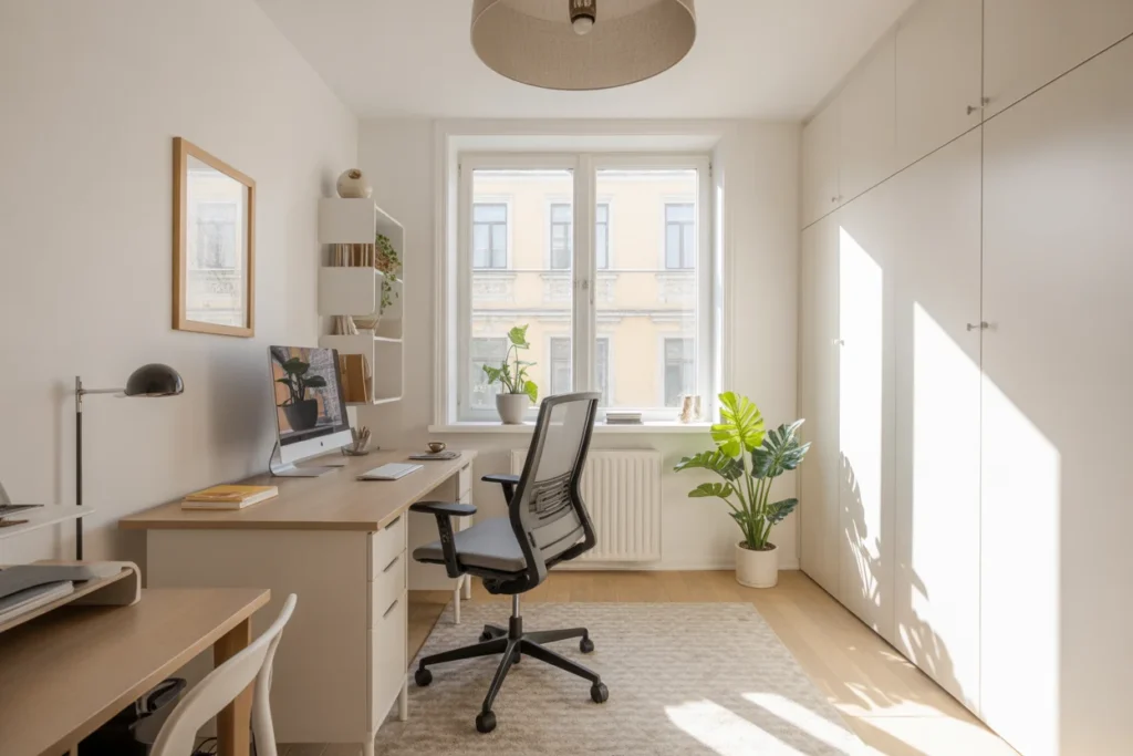
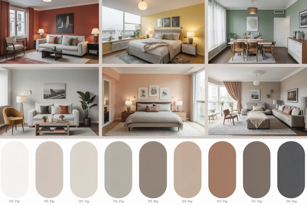
The dominant color forms the foundation of the room. It usually covers the largest areas such as walls, large furniture pieces, rugs, or curtains. Because it takes up most of the space, this color sets the mood and overall theme of the room, making color psychology an important factor in choosing the right tone.
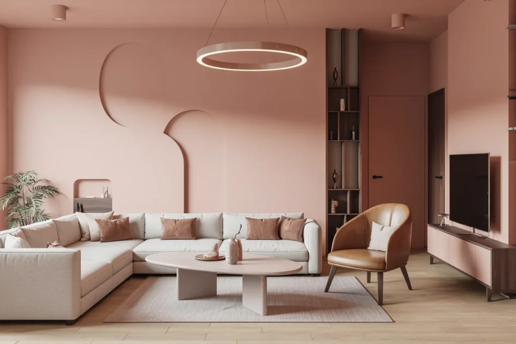
Neutral colors are commonly used as the dominant tone because they create a calm and versatile base. Shades like beige, white, gray, or soft earth tones support positive color psychology by promoting relaxation and balance, while allowing other colors to stand out and maintain harmony.
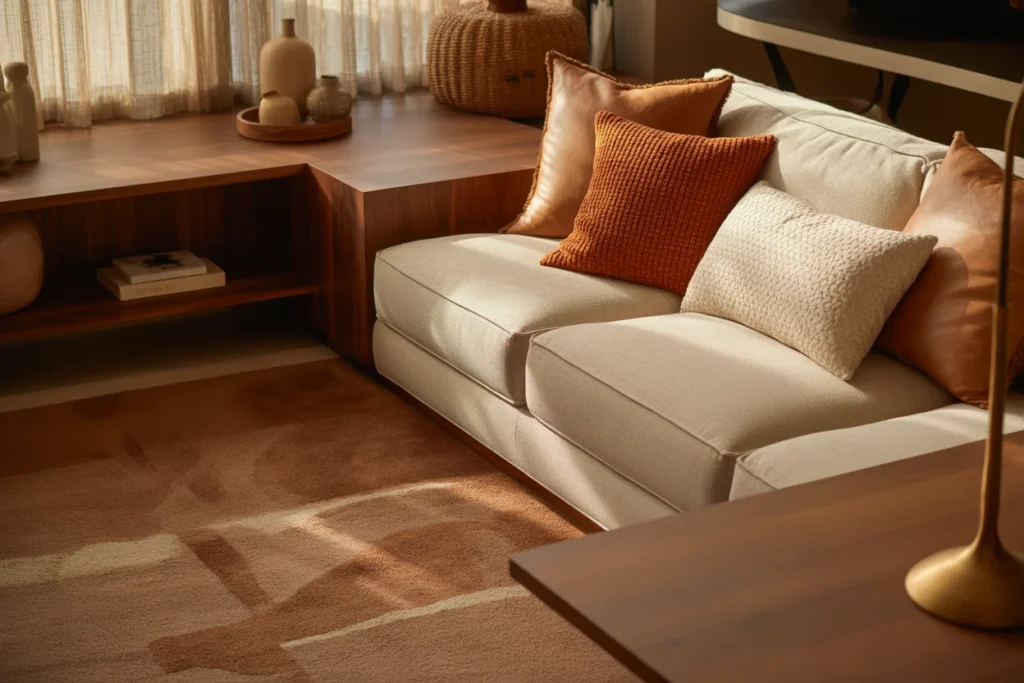
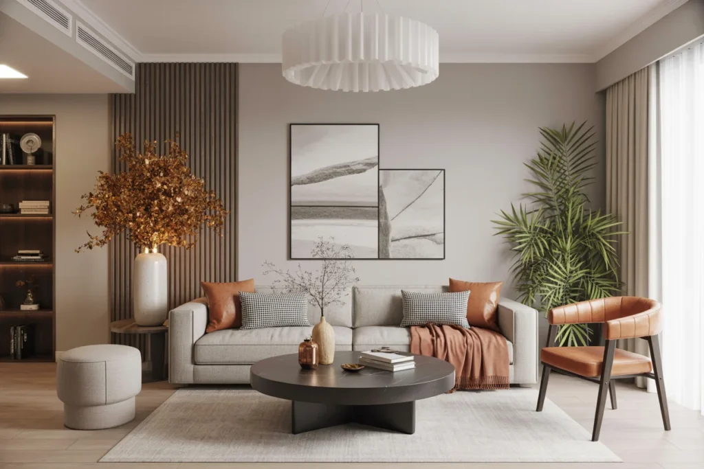
30% – The Secondary Color
The secondary color supports the dominant shade and adds visual depth to the space in the 60-30-10 Rule in Interior Design. It is usually used in medium-sized elements like sofas, chairs, bedding, curtains, or accent walls.
This color should complement the dominant tone rather than compete with it, helping maintain balance in the 60-30-10 Rule in Interior Design. Designers often choose a shade that contrasts slightly but still blends naturally with the main color scheme.
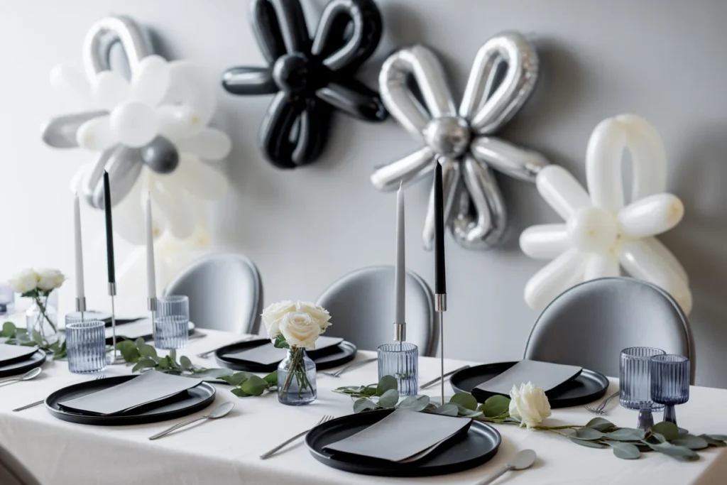
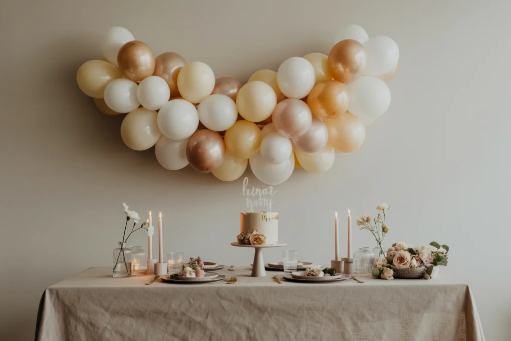
10% – The Accent Color
The accent color is the boldest part of the palette. It adds personality and energy to the room while highlighting important design elements.
Accent colors are usually introduced through small decorative pieces such as cushions, artwork, lamps, vases, or decorative accessories. Even though it represents only a small portion of the room, it has a big visual impact.
Why the 60-30-10 Rule Works
This rule works because it creates visual balance. When colors are distributed in clear proportions, the room naturally feels organized and pleasing to the eye.
It also simplifies the design process. Instead of guessing how much color to use, you can follow a structured formula that designers have used for decades.
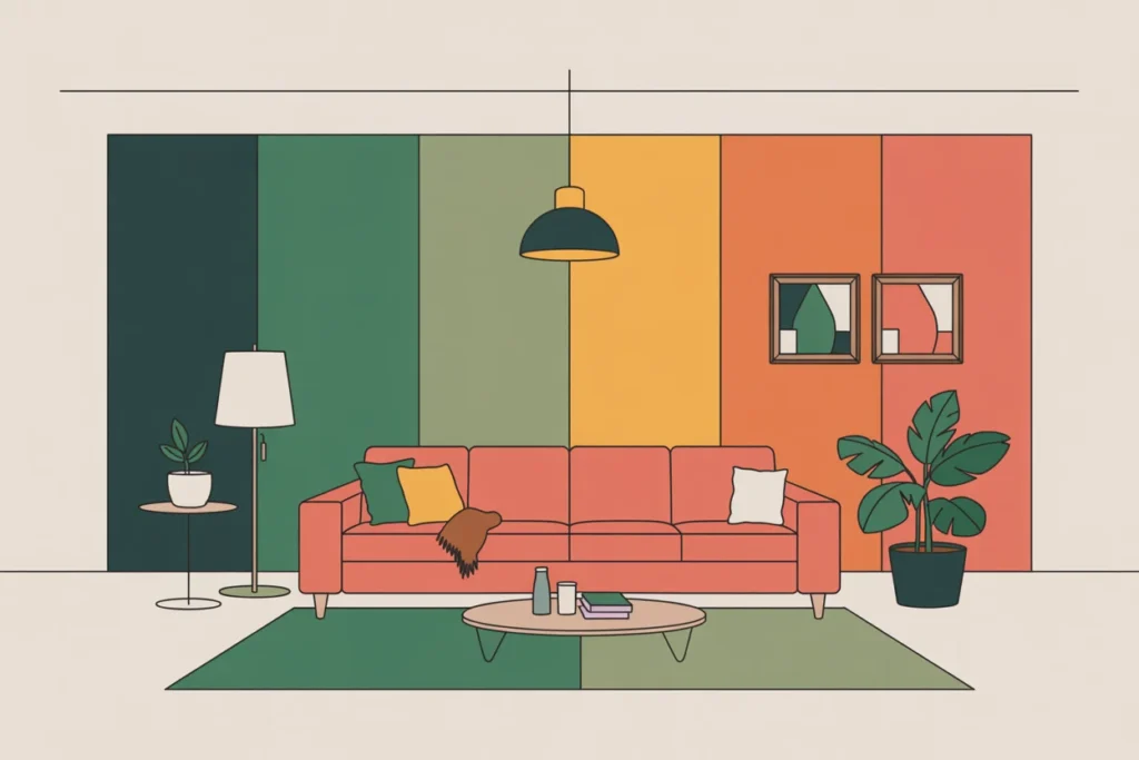
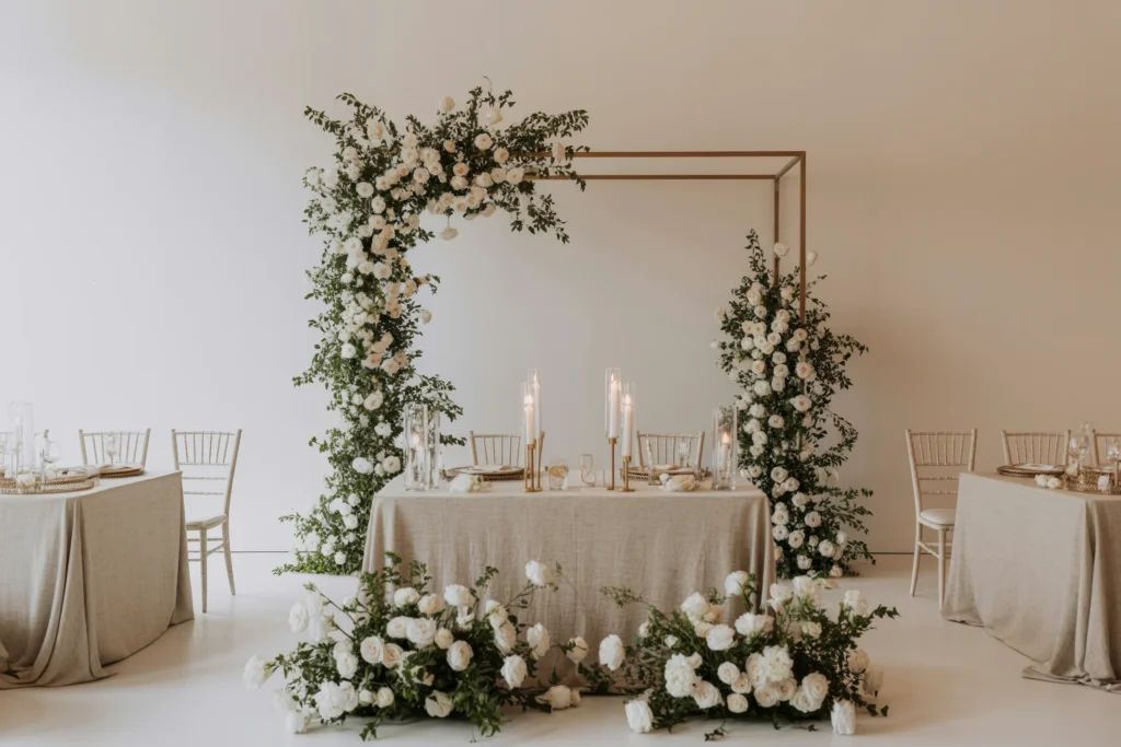
Best Color Combinations Using the 60-30-10 Rule
Some color combinations work especially well with this rule. These palettes create a balanced and stylish interior.
Example combinations include:
- White (60) – Gray (30) – Gold (10)
- Beige (60) – Brown (30) – Olive Green (10)
- Light Gray (60) – Navy Blue (30) – Mustard Yellow (10)
- Cream (60) – Soft Blue (30) – Coral (10)
These combinations create contrast while maintaining harmony in the room.
Tips for Using the 60-30-10 Rule Successfully
To make the most of this rule, focus on both color harmony and placement.
Helpful tips:
- Choose a neutral dominant color for flexibility.
- Use textures to enhance the secondary color.
- Keep accent colors bold but limited.
- Repeat the accent color in small decorative items.
Following these tips ensures the room feels cohesive and professionally styled.
Common Mistakes to Avoid
While the 60-30-10 rule is simple, some mistakes can disrupt the balance of the room.
One common mistake is using too many strong colors in large areas. Another issue is ignoring the accent color or spreading it too widely. Accent tones should be noticeable but limited.
Maintaining the correct proportions helps keep the design visually balanced.
Final Thoughts
The 60-30-10 rule is one of the easiest ways to achieve a balanced interior design. By dividing colors into dominant, secondary, and accent roles, you can create spaces that feel organized, stylish, and visually appealing.
Whether you are decorating a living room, bedroom, or home office, this rule helps guide color choices and prevents design mistakes. With the right palette and proportions, any space can feel professionally designed and beautifully balanced.
Join the Conversation